
The tension between beauty and necessity
‘Less is more’ has been the guiding principle in packaging design for years, but with the increase in the number of mandatory icons, warnings and codes, this is now a major challenge, according to Wouter. There is also the issue of international expansion. Wouter: “Growing together; across borders! This calls for packaging texts in multiple languages. We have customers where the count is now at 15(!). Where do you put all this information? How do you prevent chaos on the packaging? And how do you maintain peace and overview on the shelf?”
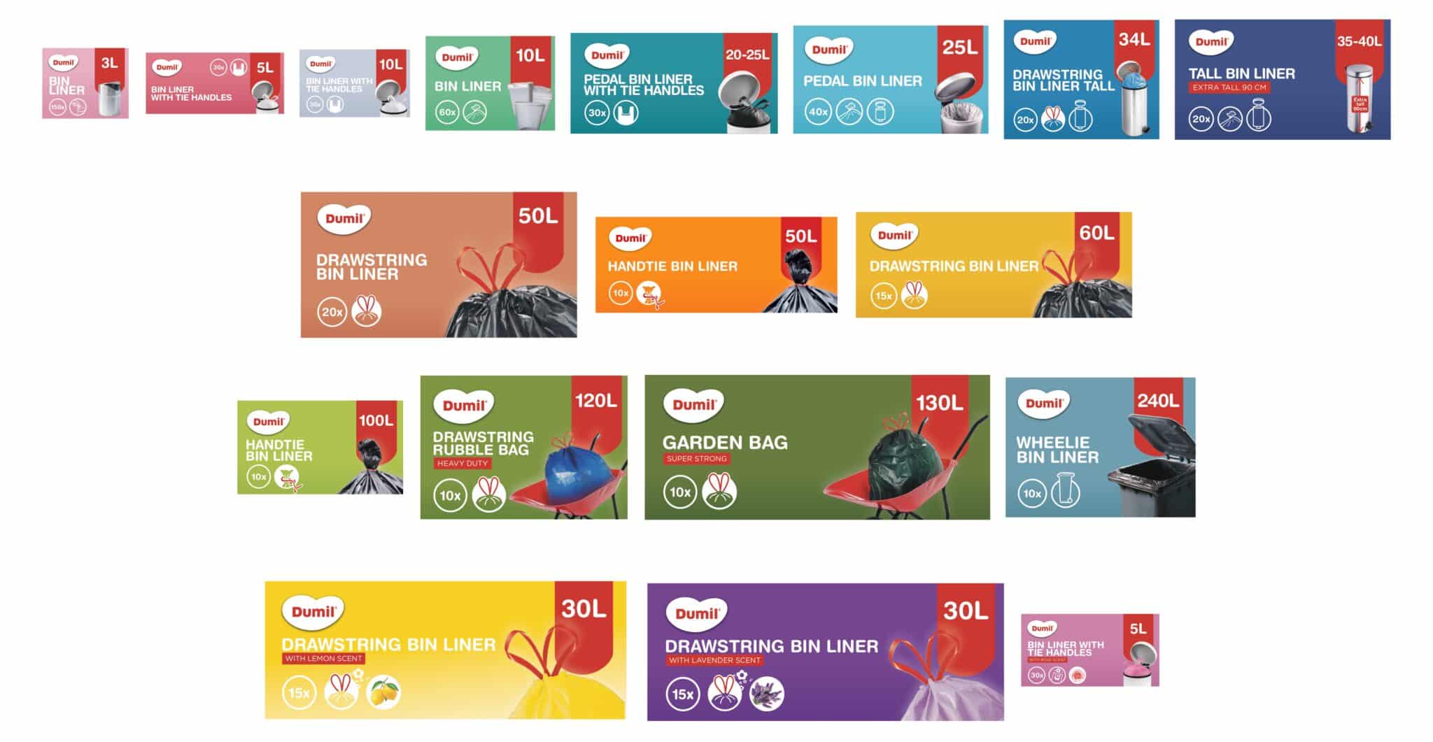
New packaging design for Dumil
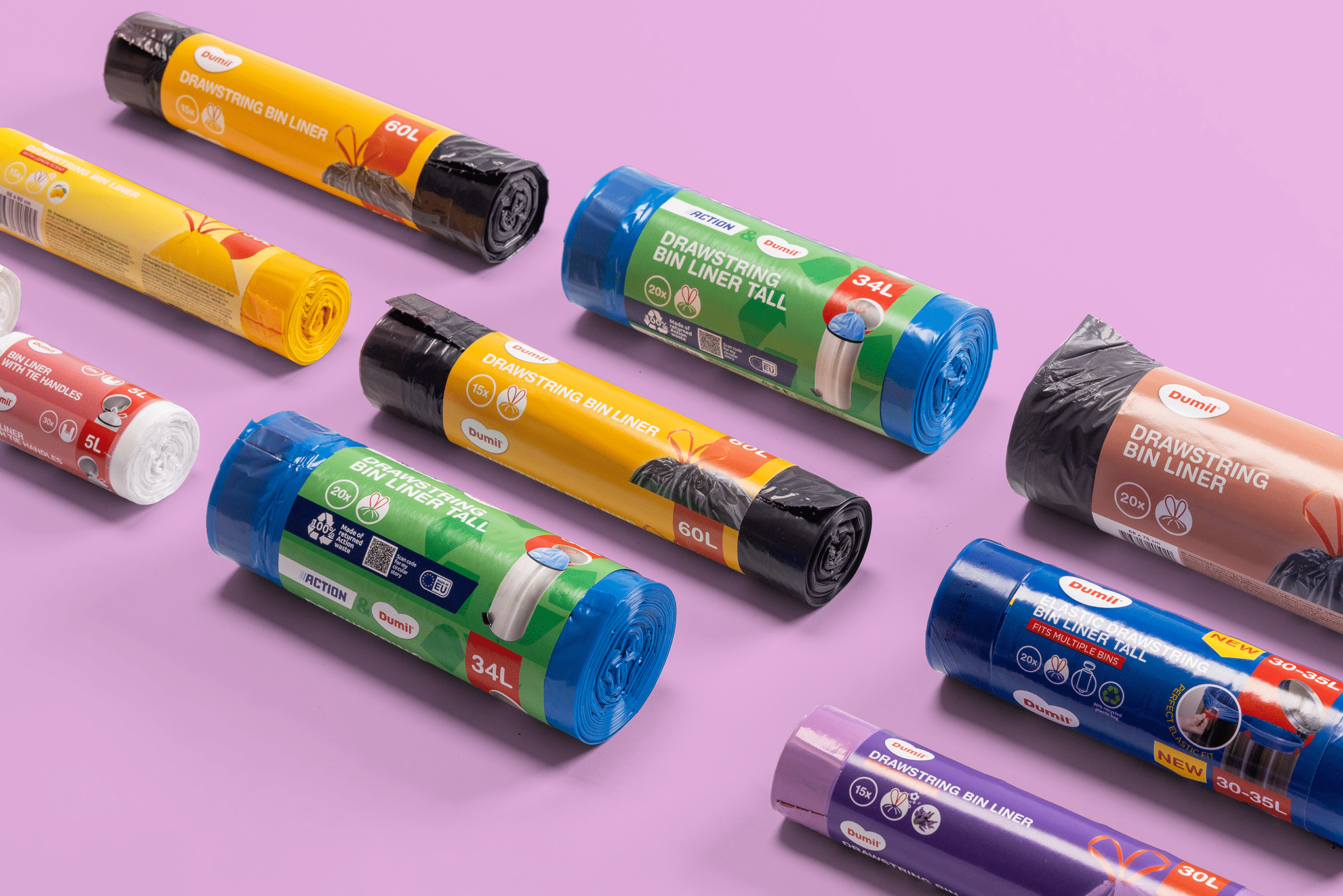
Reason for the creative team at Packit to redesign the packaging of our own brand Dumil. Wouter: “The last update of the design was also a while ago, so it was time for a fresh look! Together with our partner A5tien, we came up with a new packaging design: recognizable, in accordance with the law, clear for the consumer and striking on the shelf.”
Zoning of information
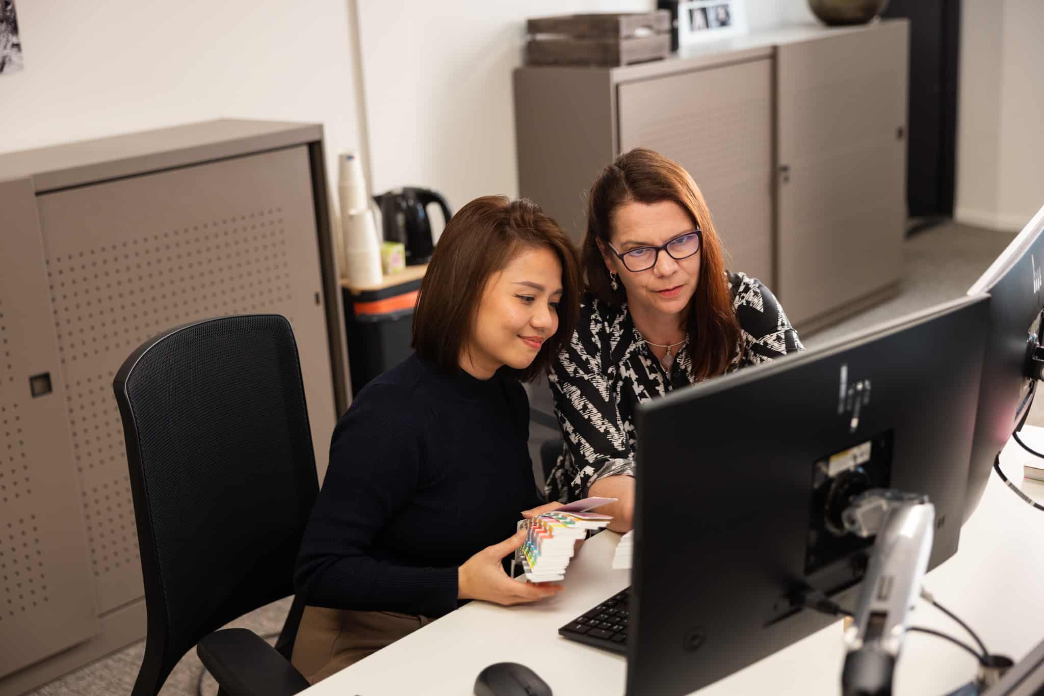
In the new packaging design, all the pieces of the puzzle come together. Wouter explains: “A zoning of information has been chosen. By working with a grid, the information is clearly displayed in columns; the most important information is always in the consumer’s view. Which information this is, is partly determined on the basis of a packaging survey among 550 consumers. In addition, based on years of experience, we know how consumers look at our articles. Once the grid was in place, Cindy, our artwork coordinator and expert in the field of printing, developed the artwork per article together with A5tien and coordinated the process.”
Informing consumers
Ton Oosterwijk, B2B Brand Strategist at A5tien, adds: “The rebranding of the packaging design was a great creative challenge for us to unite appearance and technical requirements while keeping the brand recognizable. This is not a direct problem for boxes or large waste bags. The real challenge lies in the smaller packaging units. The space on a banderole is very limited. Yet you want to inform and guide the consumer as much as possible during the purchase. I think we have succeeded in that together.”
Structure and peace on the shelf
Cindy responds that she does not do this alone. “A redesign requires constant switching and coordination with designers, customers, suppliers and colleagues from purchasing and quality. Together we ensure the correct information on the packaging and the right appearance. For example, we now work with different background colors for a better distinction between the articles. It is then a matter of switching with the supplier for the correct colors. Furthermore, we have decided to opt for English as the main language and we work with recognizable icons and images. This makes the application of the product and the most important USPs clearer for consumers more quickly. In addition, less text is needed, creating a tighter and more airy design. You can also see this reflected on the shelf: the new packaging provides structure and clarity and ensures a calm overall picture.”
“You never do a redesign alone. By continuously switching with designers, customers, suppliers and colleagues, we create packaging that is clear, distinctive and soothing.”
- Cindy Musters -
Learn more?
Don’t turn your packaging into a complicated package leaflet! The experts at Packit are happy to advise you on appealing packaging design that meets the requirements of the law and the wishes of the consumer.